Have you ever clicked a link and seen a “404 Page Not Found” message? It can be frustrating, and most people just leave the site. But what if I told you that best 404 pages can actually be useful? With the right approach, they can help your business.
In this post, we’ll look at some great 404 pages and how they can affect user experience, SEO, and conversions. We’ll explain what 404 errors are, why they matter, and how to turn them into branding opportunities. By the end, you’ll have the tools to create custom 404 pages that keep visitors on your site and boost your brand’s online presence.
What Is A 404 Page?
What is a 404 Error?
A 404 error happens when a web server can’t find the page you’re looking for. This may be due to broken links, deleted pages, or wrong URLs. When this occurs, the server sends a “404 Not Found” message to let you know that the page doesn’t exist.
How a 404 Response Code Works
The 404 response code is part of the HTTP status codes that help browsers and servers communicate about web page requests. If a server gets a request for a page that isn’t there, it sends back a 404 code to tell the browser that the page could not be found.
Common Reasons for 404 Pages
- Broken Links: Links that lead to pages that don’t exist because of typos or old URLs.
- Deleted Pages: Pages that have been taken down without redirecting users.
- Wrong URLs: Users might type the URL incorrectly, ending up on a non-existent page.
Why 404 Pages Are Important
Impact on User Experience
A bad 404 page can annoy users and drive them away from your site. In contrast, a good 404 page can help guide users back to useful content, making their experience better. A fun 404 page can even make them smile and keep them engaged.
Effect on SEO and Search Engine Rankings
404 pages can affect your site’s SEO if not managed well. Search engines like Google pay attention to user experience when ranking pages. A helpful 404 page that keeps visitors can boost your search rankings. Also, handling 404 errors correctly helps prevent search engines from indexing pages that don’t exist.
Keeping Traffic Despite Errors
Creating a friendly 404 page can help you keep visitors who might otherwise leave. Offering helpful links, a search option, and a welcoming message can encourage users to stay and explore your site.
404 Pages as a Branding Opportunity
Using Humour to Engage Users
Humour can make a frustrating experience memorable. A funny 404 page can lighten the mood and keep users interested, as long as it matches your brand’s tone.
Reinforcing Brand Identity Through Visuals
Your 404 page reflects your brand. Use visuals, colours, and fonts that fit your brand to create a consistent experience, helping users remember you better.
Encouraging User Actions
A 404 page shouldn’t just be a dead end. Use it to guide users to do things like visit popular pages, sign up for your newsletter, or contact support. Clear navigation and calls-to-action (CTAs) can turn a bad experience into a good one.
Boosting Conversions from Error Pages
Believe it or not, a good 404 page can increase conversions. By adding strategic CTAs, you can lead users to products, services, or promotions, turning an error into a chance to convert.
What Makes a Great 404 Page?
Key Elements for Every 404 Page
Clear Error Message
Let users know they’ve reached a page that doesn’t exist with a simple and friendly message. Avoid complicated terms and keep it easy to understand.
Links to Popular Pages
Add links to popular or useful pages to help users find what they need. This keeps visitors on your site and improves their experience.
Search Bar
A search bar can really help on a 404 page. It lets users quickly find what they’re looking for without going back to the homepage.
Contact Info
Include contact details or a link to customer support. This shows users you’re ready to help with any problems they have.
Design Tips
A good-looking 404 page can really help. Use nice images, stick to your brand’s style, and choose easy-to-read fonts to make it appealing and user-friendly.
Easy Navigation
Help users find their way back to important content. Add clear menus, links to popular pages, and a search bar so they can quickly find what they need.
Different Types of 404 Pages
Funny 404 Pages
Examples of Humorous 404 Pages
Funny 404 pages can turn a frustrating moment into a fun one. Here are some good examples:
- Airbnb uses playful pictures and a clever message.
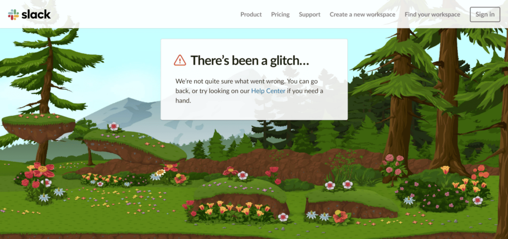
- Slack’s 404 page is designed to be stress-free and visually pleasing. It features a forest landscape with cute animals wandering around, making it a relaxing experience despite landing on an error page.
These examples show how humour can keep users interested and create a good impression.
When and Why to Use Humour
Humour works well when it matches your brand’s style. It can ease frustration and keep users engaged. Just make sure your audience will appreciate it and that the humour is suitable.
Creative and Interactive 404 Pages
How Animation and Interaction Can Help Keep Users
Adding interactive elements and animations can make a 404 page more fun. These features grab users’ attention and encourage them to stay on your site longer. For instance, a simple game or animated character can turn a mistake into a fun experience.
Examples of Fun 404 Pages
Here are some examples of interactive 404 pages:
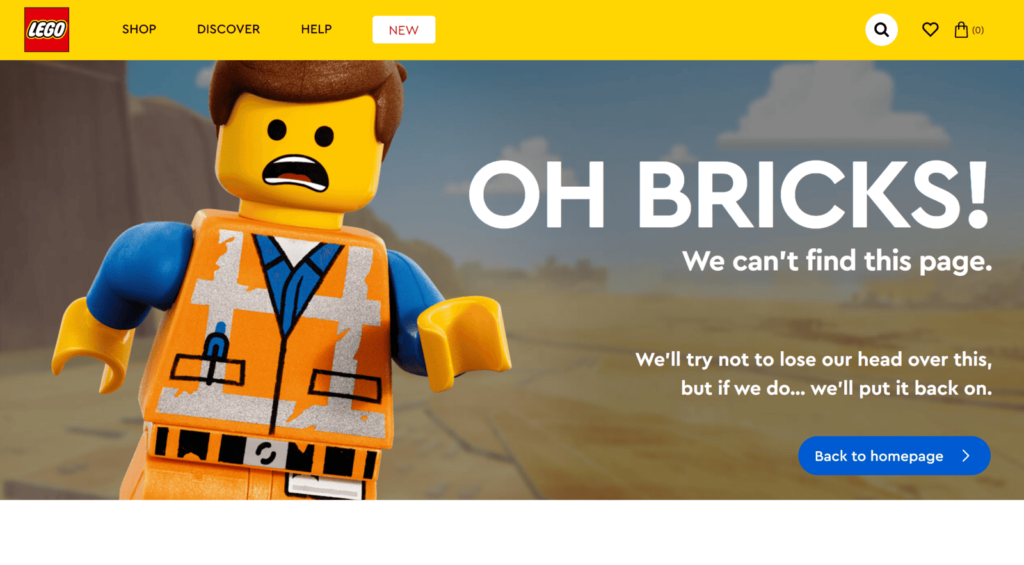
- Lego shows a playful animation of Lego characters exploring a broken page.
- IMDB offers a search bar and links to popular movies, plus a funny message.
These examples demonstrate how interaction can improve user experience and keep people engaged.
On-Brand 404 Pages
Keeping Branding Consistent on Error Pages
Consistency is important for your brand identity. Make sure your 404 page has the same colours, fonts, and visuals as the rest of your site. This helps create a smooth experience and boosts your brand’s visibility.
Examples of 404 Pages That Match Brand Identity
Some brands do a great job of keeping consistency, like:
- Nike, which uses its well-known branding and a motivational message to lead users back to shopping.
- Spotify, which showcases its familiar colour scheme and suggests music.
These examples show how on-brand 404 pages can improve user experience and strengthen brand identity.

Minimalist and Cloneable 404 Pages
Clean Design and Simple Formats
Minimalist 404 pages focus on being simple and clear. They use a clean look, short messages, and easy navigation to help users find useful content. This style is also easy for developers to copy.
How to Create a Template for Developers
To make a cloneable 404 page template:
- Keep It Simple: Focus on clarity and ease of use.
- Add Key Elements: Include a clear message, navigation links, and a search bar.
- Make It Easy to Customise: Allow developers to quickly adjust the template for different brands and websites.
Turning 404 Pages into Conversion Opportunities
How to Add Effective Call-to-Actions (CTAs)
Encouraging Sign-Ups
Add a CTA that invites users to sign up for your newsletter or create an account. This can help turn a negative experience into a potential lead.
Offering Promotions
Provide special promotions or discounts on your 404 page. This can encourage users to make a purchase even after facing an error.
Directing Traffic to Products or Services
Use CTAs to guide users to popular products or services. This can keep users engaged and boost conversions, even from error pages.
Mistakes to Avoid When Designing 404 Pages
Confusing Language
Don’t use technical terms or complicated language. Make your message simple and easy to understand.
No Navigation Back
Make sure your 404 page has clear navigation options. Without them, users might leave your site frustrated.
Missing Brand Personality
Don’t forget to show your brand’s identity. Use visuals, colours, and messages that reflect your brand’s personality.
Our Case Studies
- At It’s My Digital, we’ve had great experiences creating 404 pages that reflect a brand’s identity and engage users. One success story involved a new e-commerce platform. Their original 404 page was plain and caused many users to leave the site. We revamped it with a fun animation and a clear call-to-action (CTA) to check out trending products. This change resulted in a 20% drop in bounce rates, turning a problem into a chance for conversion.
- Another time, we worked with a financial services client who was unsure about adding humour to their 404 page because of their serious industry. We suggested a light-hearted approach that matched their brand. We created a page with a funny “lost coin” image and links to important services. This not only lightened the mood for users but also made the brand feel more approachable. The client noticed increased user engagement and more newsletter sign-ups, showing that even serious brands can benefit from a little humour.
- We also faced a challenge with a tech startup when our first design for their 404 page became too complex, with lots of graphics and interactive features. While it looked good, it slowed down the site and frustrated users, leading to more people leaving. This experience taught us that balance and performance are key. We simplified the design, improved loading times, and made it responsive, which greatly improved user retention.
404 pages don’t have to be a dead end. By making interesting and on-brand error pages, you can turn frustration into a positive experience. Include clear navigation, useful links, and a bit of personality to keep users engaged and help them find what they need. Use these tips to turn your 404 pages into effective tools for your brand.


